
The brief
Rip out an advertising image from a newspaper supplement and circle and write on
as many parts of the image as you can. Comment on what it is, what it says about
the product and why you think it’s there. You could use this as the basis for your
assignment if you feel it’s taking you somewhere interesting. Or you could adopt this
method for your assignment preparation.
Come back to this exercise when you’ve reached the end of Part Four and see if you
can add anything to your analysis.
Discussion
Background
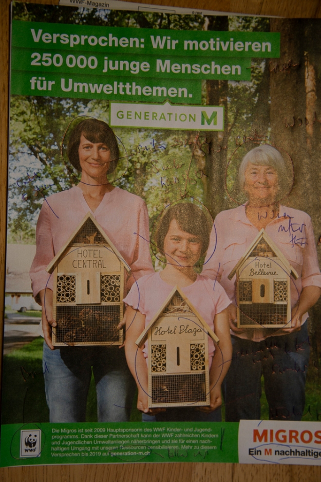
This advertisement appears in an WWF magazine and is advertising Migros and its involvement in sustainability endeavours. It is not a product advertisement as such but is clearly supporting / advertising the Migros brand.
Elements
In the image I can see the following elements and my interpretation as to what is says about the product and why it is there:
Three women
What is it
We see three women dressed in a very similar but not identical manner looking as if they are from the same family but different generations. They have a similar posture, facing the camera and with similar smiling expression.
What is says about the product
That Migros is supported by multiple generations, including the latest,
Why I think it is there
This is the main subject of the image. The women are representing the various generations with the youngest women ( girl) being the youngster referred to in the various texts. Their smiles show that they are happy with Migros. The similarity of dress and expression reinforces the idea that they belong to the same family. The colours of clothes is perhaps just aesthetic to as to complement the background green.
Three insect hotels
What is it
Each of the women is holding a similar insect hotel. The hotels are labelled with different names in differing handwritten scripts.
What is says about the product
A key element highlighting sustainability and Migos role
Why I think it is there
Insect hotels are an icon for sustainability. A lot of people buy them in the belief(?) that by so doing they are helping insect populations. A bird feeder might have played a similar role. Perhaps the labelling is there to reinforce the idea that they are insect hotels and that they have been personalised by the women carrying it?
Introductory text
What is it
An introductory text (top left), large white lettering on greenback ground promised that 250000 youngsters will be motivated by Migros for environmental themes. This is labelled Generation M
What is says about the product
Message is that we keep our promises.
Why I think it is there
It is located at a position where the viewer would naturally first read. It gives key messages that are then reinforced by the rest of the image. The use of green background is consistent with the nature and environment theme.
Forest / wood
What is it
In the background we can see trees belonging to a forest or wood.
What is says about the product
Nature and environment as being part of the messaging
Why I think it is there
This reinforces the idea of nature and environment.
Detailed text
What is it
Bottom left small text (white on green, with a WWF logo) describes how Migros is the main sponsor of WWF children’s program and high-level goals of the program. A link is given to details.
What is says about the product
We can provide details if necessary
Why I think it is there
A detailed summary for those that are interested in more details.
Final text
What is it
The final text (bottom right) is the Migros logo with a strap line saying a M more sustainable
What is says about the product
Reinforcing the message that this is Migros.
Why I think it is there
Its position is such that it is likely to be the last thing that you read, reinforcing that this is Migros plus there is a play on their normal strap line that one might find mildly amusing.
Other points
I wondered why the generations were based on women and why no man was explicitly featured. Might guess would be that it is a compromise. Having the same sex reinforces the generation message and having women rather than men might speak more to a sustainability aware audience. Could be that me are represented via the hotels??.
After reaching end of part four
Having read through the courses notes to the end of part four I think that I can formalise my observations using the tools for semiotics. My basic observations, which I believe to be still valid.
I could have structured my discussion around Denotation and Connotation, and Punctum and Studium, intertextuality and text as Anchor or Relay e.g.
Denotation: What it is
Connotation: What it says about the product.
Punctum: The three women
Studium: forest / wood
Intertextuality: detailed text
Anchor: detailed text
Relay. final text
Another approach would be to recognise the signs in the image and then discuss
Reading how others (e.g. Judith Williamson with the Apple advertisement and Sharon with Jeff Wall) have structured their analysis then Semiotics is not directly used but one can see the points being covered albeit in some cases obliquely. Another point is the bring in of the personal view and the wider context. Both of which I have omitted in my analysis (although it was not asked for – poor excuse!)
What I have learned
- There are several ways to analyse an image
- On studying and image knowing the context that it is being displayed is extremely helpful
- Advertisements provide a pure image in which messages (connotations) are intentionally provided in a clear and directing manner. The viewer is strongly directed.

Pingback: Exercise 4.5: Signifier – Signified | Open College of the Arts: A log by Peter Hungerford