Book: The Photographers Playbook

Book Details

Title: The Photographers Playbook

Author: Jason Fulford and Gregory Halpern

Publisher: aperture 2014 ISBN: 978-1-59711-247-5


Purpose of the book

The books intent is to improve photographic skills by providing a number (307) of assignments, games, projects and ideas that can be tackled either as an individual or in groups. The content has been provided by a wide range of people involved as photography, as photographers, teachers, editors…

Critique of the book

I found the book full of interesting ideas that could provide solace on a rainy day if you feel you are struggling to simply take photographs. The assignments are very wide ranging that should provide ideas for most photographers. However ,the converse is no true not all ideas will appeal to everyone. I found it a book to dip into and to be honest it has remained mainly unused since I, currently, have had no need for additional ideas! However, I regard it as a good backup in case I should run out of ideas. I like the subject index that provides a set of themes and the assignments that align with the theme.  It might, however, be difficult to perform the assignments alone, it might need a group dynamic to be more successful.

Where I find it a little weak is that there a number of overlaps between assignments and I would like to see an indication how long an assignment might take. Although the subject index does provide structure I think that grouping of assignments into themes would be helpful. For the more theoretical there is little reference to photographic theory.


My takeaways

  • There is no need to be at a loss for photographic ideas


My follow-up activities

  • Look for potential assignments for the European region student group
  • Choose a random assignment per week and work.


Content

The book consists of 307 assignments alphabetical ordered by contributor surname. This is augmented by contributor biographies and a subject index.

Book: Introducing Aesthetics

Book Details

Title: Introducing Aesthetics

Author: Christopher Kul-Want and Piero

Publisher: Icon Books Ltd 2007 ISBN: 978-1840467-90-1


Purpose of the book

The book purpose is too introduce concepts pertaining to beauty and truth and from this cover (from an historical perspective) the philosophy of aesthetics. The book is part of a series that introduces a number of advanced topics in a graphic / comic book format.

Critique of the book

This is an excellent book that demystifies through its clear language and well thought out graphics a number of key areas of Aesthetics. I enjoyed the way that the historical view supported and to an extent explained more modern philosophies such as Modernism and Post-modernism. Often these philosophies are presented in isolation and in very opaque text which certainly does not do them justice. The book can also be used as a source of explanation for terms (e.g. Simulacrum) that are frequently used in critique.

I can highly recommends this book as providing an entry into the theoretical foundations of art, including photography and to be used as an additional source of information to the OCA course notes.

My takeaways

  • Aesthetics is a very broad topic and, for me, maybe best approached from an historical perspective. Understanding first the basic philosophical concepts before tackling more advanced ideas seems to me a more profitable approach than jumping into the deep end with more sophisticated philosophies e.g. post-modernism. where I feel I might only get a superficial understanding. an analogy might be between learning Newtonian mechanics before working towards general relativity or perhaps quantum mechanics.
  • There is a strong link between politics and art. I suppose that art when it deals with groups of people, rather than the individual will naturally have political aspects.
  • I can see in the OCA course notes that various aspects of aesthetic philosophy are revealed, like light being shone on an object but the fact that there are a large number of other objects which may change ones view is not revealed.
  • Aesthetics is quite central because of its concern with experience and how we experience ourselves


My follow-up activities

  • Try to understand a philosophy idea and see whether I can capture the concepts via photography.

Content

The book consists of a series of topics discussed and illustrated as standalone subjects.  The topics are in general ordered historically. There is a list of further reading and contents.

Assignment 5: Making it up – Submission

The Brief

Construct a stand-alone image of your choice. Alternatively, you may choose to make a
series, elaborating on the same theme.
As the culminating assignment for the course you may wish to draw upon skills learned
from Parts One to Four – using various forms of narrative, using yourself as subject
matter, telling stories and reading images. The only stipulation is that you produce work
that has been controlled and directed by you for a specific purpose. Remember to create
a story with a specific context like the artists you’ve looked at in Part Five. This means
you need to have an artistic intention, so a good place to start would be to write down
some ideas. This could then form the basis for a 300-word introduction to the piece. You
may find it helpful to draw storyboards to help you visualise your ideas.
The aim of this assignment is to use props, costume, models, location, lighting, etc. to
contribute to the overall meaning of the image. (Use flash/lights if required but available
light is fine as long as it is considered.)
If the narrative is to be set in a different era then the elements of the image must reflect
this. Also consider the symbolic meanings of objects and try not to be too literal in your
approach. For example, don’t automatically use red roses in a love scene but try to be
subtle in your ideas to obtain a more true-to-life scenario.
For this final assignment, you should also include an illustrated evaluation of the process
you went through to produce your final image(s). Include snapshots of setting up the
work and write about how you felt your direction went, how you found the location,
props, etc. How did this process affect the final outcome? Write around 1,000 words in
total (including your 300-word introduction).
Send your final image(s) to your tutor, along with your commentary and relevant pages
of your learning log (or blog url).

Introduction

This blog entry is my submission for Assignment 5, Making it up. I will provide an introduction to the image, the thought processes and approach that went into the creation of the work and finally reflection on the work.

I have related blog entries: An initial image where I gathered feedback (see here), Research that informed/influenced the image (see here) and the book Photography is Magic (see review here).

Discussion

The main point of this section is to discuss in detail the process I went through in order to produce the final image. I also, briefly, describe some of the technical aspects.

Process of producing final images

The diagram above shows the high-level approach I took to get to my final image. I will take this as a basis and fleshing this out with more details.

Selection of subject

All through the section Constructed realities and fabricated images I was thinking about a potential subject for the assignment. Ideas that I toyed with were exploration of cubism, photocollages in the style of David Hockney or using Venice as a backdrop to something deeper. I had a short trip to Venice planned and felt there was potential there. I have in the past read Death in Venice by Thomas Mann and seen the 1971 film of the same name by Luchino Visconti. I was captivated by the story and decided to research these to see if I could do an hommage. Another film and story that I contemplated using was Don’t Look Now by Daphne du Maurier, also involving action in the city of Venice; however, I decided that the Thomas Mann story simply interested me more.

Background research

I reread Death in Venice by Thomas Mann and watched the Visconti film once more before my trip. I then looked at critical reviews of both. This led me on to Friedrich Nietzsche and his introduction, in his book Birth of Tragedy, of his philosophy concerning Dionysian and Apollonian forms of art (see my research here). This resonated with me and I started to see similarities with my own artistic progression, which in turn emboldened me to head in this direction. So I decided that on my trip I would look for images that illustrated Dionysian and Apollonian forms of art.  I looked for potential locations but decided in the end (primarily since I was with others) that I would not go to predetermined locations but simply look for opportunities as we visited.

Capturing images in Venice

As we went around Venice I took photographs in a number of locations, some well known (e.g. St Mark’s Square, Doges’ Palace), others less so (e.g. District of Cannaregio), looking for subjects that might be useful in interpreting Dionysian and Apollonian forms of art. In addition, I simply took shots of other subjects that I found interesting. Each night I reviewed what I had taken and this informed me of the type of images I should concentrate on the next day. I also spent time in the art museum Galleria dell’Accademia where a number of paintings caught my attention, particularly some triptychs by Hieronymus Bosch. I have always liked the idea of photographs capturing multiple dimensions of time as well as space and this seemed an option worth exploring.

Visualisation of final image

Back home I thought in depth about the final image I would create. I also saw this as an opportunity to learn to use Photoshop more effectively. I started crudely sketching out what a final image could look like. The background elements were clear to me, but at this stage the main subject was not.  I decided to go ahead and start to construct and image and see what happened. I had already decided on a single fabricated image rather than a series. I further decided against a triptych since I wanted to illustrate a journey, and felt that a triptych would not project the necessary continuity. I also decided to make a high length to height ratio image, reminiscent of the Bayeux tapestry. I was also influenced by a book that I had read, with the explicit aim of finding out where contemporary photography was heading; Photography is Magic (see review here).

Selection of images 

In Lightroom, I culled the images that I regarded as no good and then carefully reviewed them to find a set of three that I felt could act as background when merged together, moving from a Apollonian view to Dionysian, mirroring my desire to progress from mostly cerebral to more “passionate”. I also identified a number of images that I could add to reinforce this journey. In addition, I looked at photographs I had taken whilst on the OCA course and found a small number of others that I felt could fit.  However, I was still missing  the main subject.

Working in Photoshop

I have, up until now, limited experience of using Photoshop. I had an idea about what I wanted to produce and so used a number of online help videos, including those from Adobe to understand how to do this. I practiced and made a prototype that went in the direction I wanted to go. It was rather clumsy, especially in cutting out individual shapes so I decided I would start afresh. This also had the advantage of reinforcing my Photoshop learning.

Deciding on main theme

Having created a background image I decided that I need additional shots to provide the main subject. It was natural to make it a self-portrait. I decided that I wanted to mimic some of the carnival costumes associated with the Venetian Carnival, but with a hint of the Aschenbach character in Death in Venice. So I dressed in old university gown and added a Panama hat. With this I took a number of shots including some seated in a deck-chair, again echoing the final scene in Death in Venice.

Finalising the image

I added the self-portraits to the image and tidied up a little. I decided not to polish at this stage, but to submit to critique to see what the rection was. The result is here. This was generally very positive, so I decided simply to make some minor changes based on this feedback plus some other minor improvements I could see. I also printed the image on my own printer to see whether there were any overt problems; I  did not see any.

At this point I also put some thought into the final presentation.

Technical aspects

For the photographs I used a Canon 6d with a 24-105 mm lens. I stored, did minor adjustments (contrast, exposure)  and selected the images using Lightroom. I used Photoshop to merge and adjust a number of photographs in order to  create the final image.

Results

Artist statement

In this image I show how art and life are intertwined, the individual searching for meaning through questioning and creation.  We can view art and life as having both rational and emotional elements. We need to search for balance in these elements in order to have harmony. I am still looking.

Submitted Image

In search of a muse

Presentation

I can see the final image being presented as a single very large-scale print. This would reinforce the position of the central figure and allow for easier reading of the various smaller objects in the image.

Contact sheets

The following contact sheets contain the main images that I considered or used for the work.

(Click to enlarge)

Reflection

This section is a summary of the points from above and from supporting log entries. Now that I have one course (Expressing Your Vision) behind me, I use this as a reference and try to quantify this work by a rating in comparison to my previous EYV work, and using the overall result from this course as a guide. I am not attempting to compare against other students working on the same course.

Discussion

I am very happy with the end result and the way that I achieved it. I believe that it shows a well planned, strong visual image with  degree of creativity that is based both on personal and academic considerations. In producing this work I learned a lot concerning art theory as well as deepening my technical skills in Photoshop.

Demonstration of technical and visual skills

I believe that the photographs I have taken that make up the image are more than adequate in telling the story. The way I have used Photoshop to combine them is, I think, also up to scratch; here I admit I still have more to learn and practise. Where I think the work is strong is in its composition. (7/10)

Quality of outcome

I believe I have been able to take research and emotion and combine them in a coherent image. The image tells a story, albeit not easy to discern for viewers who are not aware of Nietzsches philosophy nor Death in Venice, but I also think it has the ability to work at different levels and is complex enough that it can tell differing stories. (9/10)

Demonstration of creativity

Again (by my levels) I find the work relatively imaginative; the way I have tried in a single image to bring together a number of different concepts in an engaging manner required more than my usual inventiveness. (7/10)

Context

The process I followed and the research I performed I think are satisfactory. I have looked into a number of sources of information and used them to strongly inform the work. (7/10)

Assignment 5: Research

Introduction

As part of Assignment 5, “Making it up”, I performed background  research in a number of areas that informed the work. This entry summarises this research.

My image is an amalgam of ideas centred around my own artist’s journey, the novella Death in Venice by Thomas Mann, the film of the same name by Luchino Visconti , the Art Philosophy of Nietzsche, and Venice itself. An idea that I considered but did not pursue (but may do for future work) is interactivity with an audience. I will touch all these points and summarise the learning that I achieved.

Discussion

The background to the image and research is the fact that I had a trip to Venice planned, a city I had last visited more than 30 years ago, and saw this as an opportunity for Assignment 5. Moreover I had enjoyed both the book and the film Death in Venice and decided they might provide an artistic basis so I looked at them once more. This led to a brief sojourn in the world of Nietzsche’s art philosophy, which had strongly influenced Thomas Mann. Another point that emerged was the concept of interactivity in photography. As I had a first version of my image it occurred to me that there were points that might profit by being interactive e.g. seeing what was behind a particular artefact in the image. I looked into what work had been done in this direction.

As a final point I wanted to be influenced by contemporary photography and so took a book, Photography is Magic, edited by Charlotte Cotton, and used some of the images as sources of inspiration. My review of the book can be found here.

Book: Death in Venice – Thomas Mann

DinV jpg

Details of the book (really a novella) and reviews can be found in (Crace, 2008, sparknotes.com, n.d. a) I will just refer to aspects that I found noteworthy and relevant for this piece of work.

Before studying I did not relise that the book was based on the art philosophy of Friedrich Nietzsche. What had appeared to me as simply a tragic infatuation of a older man for a young boy became something much deeper. I can start to see in the story the two art forms of Dionysian and Apollonian in many descriptions within the book combined with an underlying Greek tragedy feeling. The sparseness of the writing and the fact that every word counts seemed to be something that would be worth trying to emulate in a photograph. The basic idea of the assignment came from rereading the book.

Film: Death in Venice –  Luchino Visconti

Again background and reviews of the film can be found in (Jeffries, 2010, IMDb, n.d.). Comparing the film to the novella, I found that the story had been greatly simplified, losing a lot of the subtlety of the written work, and simply focusing on the relationship between Aschenbach and Tadzio (the main characters). What the film loses in content, however, it gains in form. The cinematography is superb, capturing the essence of old Venice, particularly the Lido, strongly augmented by a screen score based on Mahler. I wanted to copy this feeling and specifically the use of icons e.g. the camera in my image. The final scene, the death of Aschenbach sitting in a chair, dye dribbling down his face, I found particularly full of pathos and I wanted to pay homage to that in my image.

600full-death-in-venice-screenshot


Art Philosophy of Nietzsche

I have never really studied Friedrich Nietzsche and even now my knowledge would best be described as fairly superficial. Based on reviews of the book Death in Venice (sparknotes.com, n.d.) I became aware that in Nietzsche’s early work Birth of Tragedy (Meyer, 2014, sparknotes.com, n.d. b) he introduces the concept of the Dionysian and Apollonian forms of art and the need for them to be balanced if art is to be truly successful. He defines Dionysian as disordered and undifferentiated, and Apollonian as ordered and differentiated by forms. Aspects of Apollonian forms include beauty, perfection, obsession, narcissism, voyeurism, idols, fascism, frigidity, constraint, oppression, the defined, the personalised, an aggression of the eye linked to greed and desire, while Dionysian implies ecstasy, eroticism, hysteria, energy, anarchy, promiscuity, death, emotion, bodily substances and the universal (Bunyan, 2012).

I could see that my photography, and indeed my personality, are very heavily weighted towards the Apollonian; I like the idea of developing a more Dionysian approach. My journey seem to me to make the backbone of the image. I am aware that this whole premise is probably a simplistic and dated philosophy of art but in my development it provides a structure that I can associate with.


Venice

When I went to Venice it was for a short (three day) trip after a more than thirty year hiatus. I was prepared to be disappointed (I expected too many tourists, tackiness, pushy sellers of goods) but I found it enchanting and constantly full of interest. Admittedly I was there in  November, and mostly staying away from the main sights, but even the tourist numbers seemed relatively low. (Perhaps there is something for me to explore at a later date – my strong aversion to tourists although I am a tourist myself.)   Having decided on the skeleton of my project, I was on a constant lookout for locations or elements that would either fit into the concept of Dionysian and Apollonian forms of art, or echoed Death in Venice. I found several good locations ranging from inside the  Doges’ Palace to a small park in the northern sestiere of Cannaregio; additional elements included paintings I saw in a small local restaurant. The colours associated with Venice, and also those associated with the gods Apollo and Dionysus, were ones I enhanced in my image.

Interactivity in photography

As I was developing the image in Photoshop it occurred to me that some of the elements that I were introducing, e.g. paintings, prow of a gondola etc., might benefit from being interactive. An electronic version could be programmed in such a way that touching the element would either transform it or text would appear, providing the viewer with a richer experience. I was sure that this could not be an original idea, so I enquired at a recent OCA hangout (here) whether there were artists or work that used interactivity and how technically this might work. I was pointed in the direction of Adobe Animate as a tool for creating interactive content. Examples can be found in the following references (Vimeo, 2016, CyArk, 2013).

After initial hesitation to pursue this aspect because of time constraints I was prompted by my tutor to look more into this.

Adobe Animate

I spent quite a long time teaching myself how to use Animate. I used primarily the Animate help videos and other online resources. The main difficulty for me was to understand and use the concepts of frames (the time dimension). This involved producing a number of prototypes and attempts before i could produce the effects that I wanted.

Interactive works

Through discussions with fellow Swiss based students I was made aware of a visit to the MuDA – Museum of Digital Art, Zurich where there were a set of exhibitions that offer viewer interactions. This visit has been written up by Stefan and some material showing the visit are stored on the European Regional group drive.

As is often the case I like to first create material and then look to see how others have worked rather than taking influence from others before creation. I find great enjoyment in finding solutions myself rather than look at potential solutions first.  Clearly there are arguments for either approach. Looking at the interactive works, the work Neon Bible  from Arcade Fire stood out as something that had similarities with my work:

  • use of music, albeit the fact that here music plays the central role, while in my work it is just background
  • The interactivity with individual elements of the composition, where by placing the cursor over an element causes changes in the composition.

Having looked at this work I could imagine how if I had seen it first I may have created something different, for example less static and more like a film or game. But once the basis of a work has been created it is very difficult to significantly change the degree of interactivity.


What did I learn

Through this research the following are the major points of learning for me:

  • The theory of Dionysian and Apollonian forms of art speak to me at the moment. I could well believe that in our Post, post-modernism age it might be regarded as too simple and out-dated, but it is currently serving me well.
  • Use of interactivity is a dimension to my photography that I want to explore
    Looking at other art forms is inspirational for producing photography
  • Animation can add an extra dimension to a photography and provides a means by which the viewer can more closely into the work.
  • A key decision point is where on a spectrum between a static image and a fully interactive game-like work a particular composition should lie.


References

Bunyan, M. (2012). Apollonian and Dionysian ideals | Art Blart. [online] Artblart.com. Available at: https://artblart.com/tag/apollonian-and-dionysian-ideals/ [Accessed 3 Dec. 2018].

Crace, J. (2008). Digested classics: Death in Venice by Thomas Mann. [online] the Guardian. Available at: https://www.theguardian.com/books/2008/aug/30/5 [Accessed 3 Dec. 2018].

CyArk (2013) Session 3: Sarah Kenderdine iGLAM at City University of Hong Kong, [online video], Available from: https://youtu.be/MWamGEEWaqc [accessed 3 Dec. 2018]

IMDb. (n.d.). Death in Venice (1971). [online] Available at: https://www.imdb.com/title/tt0067445/?ref_=tt_urv [Accessed 3 Dec. 2018].

Jeffries, S. (2010). Death in Venice: No 14 best arthouse film of all time. [online] the Guardian. Available at: https://www.theguardian.com/film/2010/oct/20/death-venice-arthouse [Accessed 3 Dec. 2018

Meyer, M. (2014). Nietzsche and The Birth of Tragedy // Notre Dame Philosophical Reviews // University of Notre Dame. [online] Notre Dame Philosophical Reviews. Available at: https://ndpr.nd.edu/news/nietzsche-and-the-birth-of-tragedy/ [Accessed 3 Dec. 2018].

Sparknotes.com. (n.d. a). SparkNotes: Death in Venice. [online] Available at: https://www.sparknotes.com/lit/venice/ [Accessed 3 Dec. 2018].

Sparknotes.com. (n.d. b). SparkNotes: The Birth of Tragedy. [online] Available at: https://www.sparknotes.com/philosophy/birthoftragedy/ [Accessed 3 Dec. 2018].

Vimeo. (2016). Wendy Plas | What the world knows about you – conductive paint, arduino & Max Msp Jitter – Josien Niebuur. [online] Available at: http://bkv.academieminerva.nl/media/16063 [Accessed 3 Dec. 2018].

Exhibition: The Hepworth Wakefield Virtual Study Visit – 14th November 2018

Introduction

The OCA as a trial arranged a virtual study visit to the Hepworth Wakefield 22nd June – 07 Oct 2018): ‘Lee Miller and Surrealism in Britain’ and ‘Viviane Sassen – Hot
Mirror’. we looked into the works of Lee Miller and Viviane Sassen (The Hepworth Wakefield, 2018ab). This blog entry records my impressions of the photographers and my learning from the visit. The study was led by Helen Warburton an OCA tutor.

Discussion

in this discussion I will not repeat their backgrounds nor that of the exhibition that is  supplied via the pre-reading but just list the points that struck me as interesting through my own research or through the discussion in the virtual study 

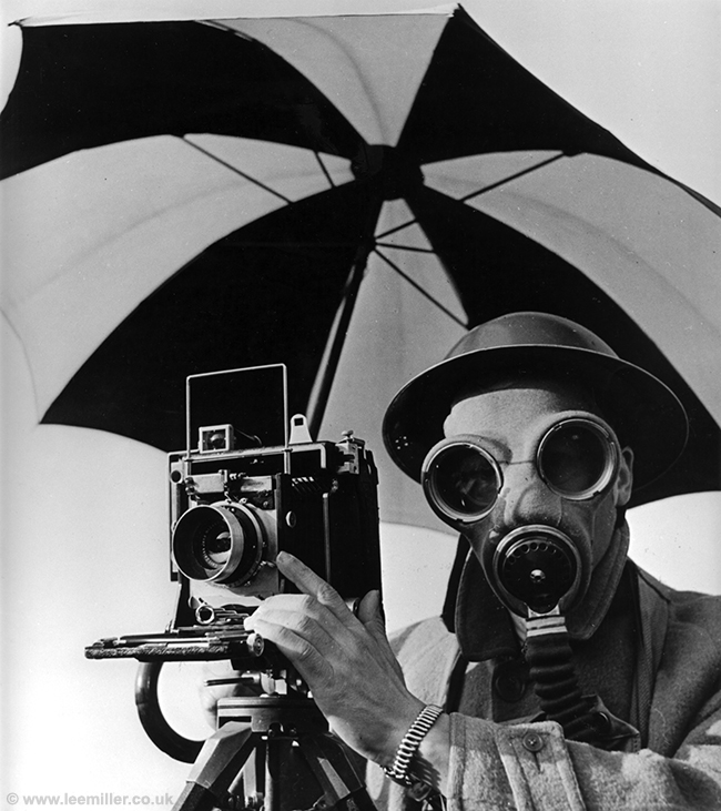
Lee Miller

web_NC0051_11-David-E.-Scherman-dressed-for-war-London1943

© Lee Miller Archives, England 2018

  • In discussion we noted that a self-portrait may contain more than one person. I will have to think this through.
  • Understanding the historical context really us required if one is trying to understand the work of a particular artist

Viviane Sassen

vs

©Viviane Sassen, Ra, series Mud and Lotus 2017

  • She tends to use props that provide  contrast and harmony.

  • The props are used to hide part of the body

  • The props create the Surrealism feel

  • Through hiding parts of the body we have to fill in the gaps with our imagination plus this creates a feeling of uneasiness.

Comparing the artists

  • Interesting that the curator choose the two women artists in the same exhibition
  • Both artists have similar backgrounds, models becoming photographers
  • Allows us to compare their work from an historical perspective
  • Can see similarities e.g. surreal feel, use of portraiture hiding parts of the body but also differences e.g. strong use of colour (technical limitation?), degree of surrealism (accidental v. intentional)

The format of a virtual study visit

The virtual study meeting is a new concept from OCA and aimed at students that are not able to take part in face-to-face meetings. I found the format worked well, the critical point being the material that was provided as pre-reading. This was excellent and obviously required a large amount of effort to create. I also appreciated the questions that were asked within the material, they acted as a catalyst for deeper analysis.

The material can be found here

My takeaways/ to do

  • Look at the Moma YouTube channel
  • Look into the Angels of Anarchy exhibition
  • Follow up with Giorgio de Chirico – I love his style of painting – can I emulate with photography?

What did I learn

  • In terms of visiting exhibitions (virtual or otherwise) performing some research before going allows a deeper appreciation and understanding.
  • Understanding why a curator has constructed an exhibition in a particular way can be insightful.
  • Examining two artists who works are related allows for a more profound discussion, through comparing and contrasting, their work.

References

The Hepworth Wakefield. (2018a) Viviane Sassen: Hot Mirror exhibition at The Hepworth Wakefield. [online] Available at: https://hepworthwakefield.org/whats-on/viviane-sassen-hot-mirror/ [Accessed 2 Dec. 2018].

The Hepworth Wakefield. (2018b). Lee Miller and Surrealism in Britain at The Hepworth Wakefield. [online] Available at: https://hepworthwakefield.org/whats-on/lee-miller-and-surrealism-in-britain/ [Accessed 2 Dec. 2018].


Book: Photography is Magic

Book Details

Title: Photography is Magic

Author: Charlotte Cotton

Publisher: aperture 2015 ISBN: 978-01-59711-331-1

Purpose of the book

To be honest it’s not really clear to me. The best way I can summarise it is as a survey of contemporary photographers  (work from approximately 2010 to 2015) broadly discussed using the framework of magic.

Critique of the book

In Cotton’s introduction she discusses various forms of magic and how  a particular form close-up can be used as a metaphor for understanding the contemporary photography scene. She goes into a great detail of various magical techniques but unfortunately does not relate any of this to the images or photographers in the book so it is left theoretical and up to the reader to determine possible connections. Cotton produces, in the essay, a useful overview of the development of digital photography, highlighting the evolution and directions that modern technology has allowed modern photographers to take.

The majority of the book is filled  with large format  images of the work of the various photographers. These I found fun to skim through, looking in detail at images that attracted me. Although there was no discernible structure to the images, being simply grouped by photographer I was left with strong impressions as to the directions of modern photography and feel that the book can be useful as a reference.

If feels that the book would have been much stronger if the publishing editor had taken Cotton more to task, providing examples in her introductory essay, structuring the photographers in themes and finally ensuring that the various artist statements were more consistent in form and content.

My takeaways

  • P4 software as the dominant photographic medium
  • P6 Idea that constants become variables
  • P9 distinctions between artists, amateurs, producers of photographic images/objects becoming more and more blurred
  • P13 Photography becoming a 3D medium (e.g. through 3 D printing)
  • P17 Post-Internet is a broad description of artistic practices that take for granted the networked and integrated nature of the Internet.
  • Reviewing the images I see:
    • Collage and multimedia work is popular
    • Bright contrasting colours feature
  • Artist statements vary greatly in style and content


My follow-up activities

  • Look at specific photographers who’s work resonates e.g. Shirana Shahbazi, Victoria Fu, Hannah Whitaker, Owen Kydd, Amir Zaki and look more deeply into their work
  • Use of examples in Assignment 5

Content

The book consists of:

  • An essay by Charlotte Cotton exploring parallels between magic and contemporary photography
  • A section of photographs from (approx) 80 contemporary photographers
  • Artist statements from the photographers
  • Index

Assignment 5: Making it up – DRAFT for feedback


The Brief

Construct a stand-alone image of your choice. Alternatively, you may choose to make a
series, elaborating on the same theme.
As the culminating assignment for the course you may wish to draw upon skills learned
from Parts One to Four – using various forms of narrative, using yourself as subject
matter, telling stories and reading images. The only stipulation is that you produce work
that has been controlled and directed by you for a specific purpose. Remember to create
a story with a specific context like the artists you’ve looked at in Part Five. This means
you need to have an artistic intention, so a good place to start would be to write down
some ideas. This could then form the basis for a 300-word introduction to the piece. You
may find it helpful to draw storyboards to help you visualise your ideas.
The aim of this assignment is to use props, costume, models, location, lighting, etc. to
contribute to the overall meaning of the image. (Use flash/lights if required but available
light is fine as long as it is considered.)
If the narrative is to be set in a different era then the elements of the image must reflect
this. Also consider the symbolic meanings of objects and try not to be too literal in your
approach. For example, don’t automatically use red roses in a love scene but try to be
subtle in your ideas to obtain a more true-to-life scenario.
For this final assignment, you should also include an illustrated evaluation of the process
you went through to produce your final image(s). Include snapshots of setting up the
work and write about how you felt your direction went, how you found the location,
props, etc. How did this process affect the final outcome? Write around 1,000 words in
total (including your 300-word introduction).
Send your final image(s) to your tutor, along with your commentary and relevant pages
of your learning log (or blog url).

Discussion

This blog entry is intended as a first draft to gather initial feedback. Later entries will give a full introduction to the image, my thought processes and the approach I took. For the moment as some context to the image, being deliberately obtuse in order not to colour the viewers interpretation,  I would say that it is influenced by:

  • A recent trip I took to a famous location
  • A book and film related to that destination
  • The underlying philosophical basis for the book
  • My own artistic /photographic experiences

The work involved extensive use of photoshop, a tool that I am only now coming to grips with. There are a number of minor visual improvements (e.g. cleaning up some masks) I would make, based on my somewhat improved skills, before submission. 

Questions I have

  • Is the image interesting / ambiguous enough to draw the viewer in or is it too explicit?
  • I would be interested in interpretations that people might have
  • Does anything jar?

Result

Working title: In search of the muse

(click to expand and if necessary choose full screen to see details)


Feedback (3rd December 2018)

Having submitted the work for critique (see here) I can summarize it as follows:

  • Consider making a triptych 
  • Very intriguing with lots of interesting detail
  • Enjoyed the colour palette
  • Impressive
  • Consider making human size – frieze type mural
  • Consider more contrast and/or adding lines to support composition
  • Visual interesting.
  • Small improvements to the added objects

Generally I was quite happy with this feedback and will make some adjustments to the image and submit to my tutor.


Exhibitions Kunstmuseum Basel

Introduction

On the 14th November 2018 I visited the Kunstmuseum in Basel with another student (Stefan Schafeld Stefan513593 Fine Arts level 2) and we looked at a number of exhibitions and had a number of interesting discussions. This blog entry describes two of the exhibitions we visited (from my perspective) and a number of discussion points that emerged.

Focus Andreas Gursky

gursky

Andreas Gursky: Frankfurt (Foto: Karen Gerig / © Pro Litteris, Zurich)

The museum had a small exhibition showing a group of large scale photographs (six) mostly from the early 21st century. The photographs show scenes from the Frankfurt airport, Tokio stock exchange, workers in Vietnam, laying of turf in Amsterdam stadium, gravel. The subjects are to the most part concerned with globalisation.

My reaction to the exhibition is as follows. The scale of the photographs is appropriate based on the chosen subjects. It allows the viewer to explore all the details that are captured in the images, looking at people going about their business in differing ways. We see blurred images of people (the workers?) moving rapidly while others are stationary and clear (the leaders?). Overall the images also have patterns within them: the boards in the airport, the lines of lights in the factory, the lines of turf…

The only image that did not fit easily into the set was one depicting gravel (Untitled). The scale of the image was not clear, were we looking really at small pieces or larger rocks? There was nothing in the photograph that really attracted the eye, although the longer I looked the more small details came out – what was the blue tinge on the left of the image? But all-in-all I did not see how it fits into the theme of globalisation.

Video / Film Bestandsaufnahme (Assessment)

kunstmuseum video

From the Basel Kunstmuseum collection

The museum had an exhibition of videos from its collection. The intent is to show content that the museum has from the early 1970’s and to revisit a very productive and inventive time that artists had exploring the new media. The video’s, although digitised to preserve them were shown on old television sets and in one case by overhead projector. I saw an number of videos but will only report on two, giving my impressions. I enclose links that show the videos on line.

A place called lovely – Sadie Benning

The video can be seem here.

In this video Benning explores a wide spectrum of violence that individuals might find in their lives. She uses a number of visual mechanisms (e.g. toys, closeup, long panning shots) in a documentary style to illustrate the impact and sources of violence.

I found the video unsettling, the (intentional or a function of the lack of maturity of the technology?) jerkiness, graininess of the film adding to it’s impact. The neutral voice over, giving facts (e.g. twenty seven children murdered in Atlanta in one year) providing an emotional layer that I found quite moving and though provoking.

Merce by Merce by Paik

The video can be seen here

This is a video made by Nam June Paik, in collaboration with Merce Cunningham and Shigeko Kubota. The video is a two-part tribute to postmodern choreographer Merce Cunningham and the artist Marcel Duchamp. It explores art, life and time through a collage of dance sequences (Cunningham), interview with Duchamp and other film sequences from new York.

There were a number of scenes that stood out for me: a scene of taxis with an extremely effective very long panning shot that seems to last forever (how was this done?). There was text over this asking “Is this dance?” This was very effective in questioning what it is that is dance and made me aware that I had never thought about this, and could not easily answer. Another scene was the interview with Duchamp which was cut so as to move forward and backward in time again giving a feeling of a dance but in time not space.

Other points

Through conversation with Stefan we touched on a large number of topics. I have recorded some of the points and my interpretations.

Different between video and cinema

Could be as simple as seats – hard for video, confortable for cinema! Other aspects include the ease that one can leave a performance, quality of image (video may deliberately be poor)

Ensuring that OCA is meeting personal needs

We discussed that the OCA while maybe is an end in itself also should provide support for specific need. As an action I should contact my tutor about a number of topics that have /(will not?) be addressed by the course.

Creating Art for an environment

An aspect to consider is when planning work how it is to be displayed and can the environment (e.g. lighting) be used as part of the work? Painting can actually be created in the gallery itself by painting on walls…

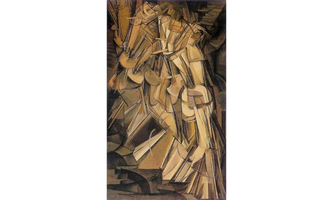
Marcel Duchamp

Duchamp also produced cubist work which is of interest for my final assignment

duchamp

Nude descending a staircase no 2.

I will investigate this further as part of the assignment.

Why create art?

Number of possible reasons:

  • Helping to resolve / alleviate personal issues
  • Commercial
  • Wanting to promote change
  • Intellectual challenge.

this is an area I need to explore further and understand why do I take photographs and for whom?

Process of creating work

Differing ways between initial gathering of ideas to obtaining the “final” work.

As an action I need to explore other ways that my standard. Just to see where it takes me.

Use of “modern” technology and longevity of art

If artists use modern technology to create art, how much is it (as art) diminished when the technology becomes common place / old?

What did I learn

  • Lots of synergies by discussing art with someone from another discipline
  • Good photographs can work both at the detailed (micro) and macro level
  • I need to consider how the OCA can help with where I want to go rather than simply following its curriculum. But i need to understand my goals….

Project 2: The Archive – exercises

The Brief

Question for Seller re-situates images in a different context and in so doing allows for
a new dialogue to take place. Reflect on the following in your learning log:
• Does their presence on a gallery wall give these images an elevated status?
• Where does their meaning derive from?
• When they are sold (again on eBay, via auction direct from the gallery) is their
value increased by the fact that they’re now ‘art’?

Discussion

Impressions  of Nick Bird’s Question for seller.

I looked into a Bird’s Question for Seller and some articles analysing the work ((Bird, 2018), (Seesawmagazine.com, 2007), (Boothroyd, 2013) ). From these I got the following idea and thoughts:

  • Throwing away old analogue shots, how does this compare with deleting digital images?
  • I like the way she has explored value and especially market value with this work
  • The idea that we put off the inevitable by recycling the pictures (selling on eBay) rather than simply throwing away is interesting
  • How meaning is created, is a topic i had never thought deeply about. It’s not easy!

Questions

To the question whether showing pictures on a gallery wall evaluates an image status, I thin the answer is yes. The mere act of selecting something for show increases its value, what ever we understand as value! Prime (extreme) examples of something with next to no value being increased in value by selection are The Fountain (a urinal) by Marcel Duchamp and Artist’s Shit (faeces in tin cans) by Piero Manzoni. A discussion about why the significant amount of increase in value could be interesting…

Where their meaning drives from? This started me thinking about the word meaning. My first thoughts are that an object does not have any meaning in itself but is assigned meaning by the viewer. But on reflection this is perhaps too simple. The object and the context in which it is seen promote a reaction in the viewer which gives an initial meaning. The viewer will have been influence by their previous experiences in order to assign this meaning. Subsequently further experiences (eg discussions with others) may change this meaning. In the case of Question for Seller strong influences on the meaning will be the images themselves and the accompanying text. In many cases the text, because the images are rather undistinguished will be the dominating factor.

When they are sold again the value (for buyers/art collectors) will be increased because the are assigned as being Art and have be selected for sale both factors seem to increase value.


The Brief

Do you have any archives that you could have access to? Might you be able to use it for
the beginnings of a project? Blog about some ideas that you could come back to some
day.

Discussion

I have a large number of photographs inherited from my wife’s mother, these are mainly family (labelled) photographs but may provide the basis for a project.

The photographs as such do not interest me sufficient to make a project (although Birds work certainly has raised my interest!) but if I had to create a project then the follow might be approaches:

  • Assemble in the form of a family tree
  • Combine with geographical information
  • Embed in text that either come from their era or about them (from existing relatives)

What did I learn

  • The idea of meaning is complex and no doubt there is a lot of research in this area
  • Use of vernacular photographs is a valid approach to create art but why do i feel that this is cheating? I still feel I need to be taking the original image.


References

Bird, N. (2018). Nicky Bird – Artist and academic. [online] Nickybird.com. Available at: https://nickybird.com/ [Accessed 8 Nov. 2018].

Boothroyd, S. (2013). Nicky Bird | photoparley. [online] Photoparley.wordpress.com. Available at: https://photoparley.wordpress.com/category/nicky-bird/ [Accessed 8 Nov. 2018].

Seesawmagazine.com. (2007). SEESAW MAGAZINE: Question for Seller. [online] Available at: http://seesawmagazine.com/sellerpages/sellerintro.html [Accessed 8 Nov. 2018].

Exercise: Setting the scene

The brief

Watch this famous scene from Goodfellas directed by Martin Scorsese in 1990:
http://www.youtube.com/watch?v=OJEEVtqXdK8 [accessed 24/02/14]
Don’t read on until you’ve answered the following questions.
• What does this scene tell you about the main character?
• How does it do this? List the ‘clues’.

Discussion

We can tell that the main character (Henry Hill) is that he is powerful, influential and has many associates / friends.

In the shot we see him take a back route into a very popular restaurant / show with his girlfriend in order to (among other things) jump the queues. He spreads his largess / bribes a number of employees who know him well and let them pass and help them on their way, the employees are all very differential, for example rushing to set up a table for them in prime position to see the show.  Associates are very friendly and give them a bottle of wine.

The Brief

Look up the work of Gregory Crewdson online.
Watch this YouTube video about Gregory Crewdson and his work and consider the
questions below.
http://www.youtube.com/watch?v=S7CvoTtus34&feature=youtu.be [accessed 24/02/14]

(https://youtu.be/ZGhfORGNe3g Updated link accessed 06/11/2018)

• Do you think there is more to this work than aesthetic beauty?
• Do you think Crewdson succeeds in making his work ‘psychological’? What does this
mean?
• What is your main goal when making pictures? Do you think there’s anything wrong
with making beauty your main goal? Why or why not?
Crewdson’s work is deliberately cinematic in style and as a result is often very popular in
commercial settings. The dark nights, the heavy lights and the perfectly styled locations
and actors aren’t meant to fool us into believing those moments are real, but rather they
seduce us into entering the world of fiction. This visual strategy of elaborate direction,
as in film, makes us lose our sense of reality and become absorbed with the alternative
reality we’re faced with. Some commentators regard this is an effective method of
image-making, but for others it lacks the subtlety and nuance of Wall and DiCorcia’s
work. What do you think?

Discussion

From the video I picked up the following points:

  • Photography is a lonely and voyeuristic pursuit (Crewdson view)
  • His narrative consist of single moment shots where the image asks more questions than answers. He aims for beauty and mystery.  He tries to get the images outside of time – could be anywhere, anytime – nondescript
  • Crewdson focus on formal issues (e.g. composition) when creating images but an underlying (dark) feeling just emerges

To the questions:

The work I do find beautiful. I am attracted to the clarity of the shots and their composition, light plus the subject matter.   I think Crewdson rises above the pure aesthetic by the compositions and particularly the models. Their often near dead-pan expressions make one wonder what they are thinking, or remembering. As such I would say that the work does have a psychological aspect. For me a psychological aspect means that we are dealing with something to do with the state of the mind.

I have a number of goals when I take photograph depending on my mood or inclination. I can list them as.

  • Trying to capture the essence of a scene (often the out doors)
  • Simply taking images that have a aesthetic beauty or a quirkiness that attract the eye
  • Using them as an intellectual exercise to explore, especially art

Taking photographs simply for beauty I consider a valid approach, it is one that has been the basis for much art over the centauries. However, if we want to engage an audience on topics other than beauty then the image has to engage the brain, providing potential narratives, interpretations about the topic.  I would argue that this does not mean that the image has to be boring / ugly  (although being beautiful may detract from the message) but benefit by being visually interesting in order to attract our attention in the first place.

Does Crewdson cinematic approach “lack the subtlety and nuance Wall and DiCorcia’s
work”? This is an interesting question where my initial thoughts are about the general case, which could be: Is an constructed image (art in general?) not as subtle and nuanced as reality (which it is representing). To this question I don’t know the rational answer, my gut feeling is that reality is a step ahead of art and that we can not be as subtle or nuanced. Specifically comparing Crewdson with Wall I find that both have aspects that attract me. I enjoy the cinematic, clean visuals of Crewdson but do find the narrative of Wall interesting . So I think it fair to say (in my opinion) that  Crewdson’s work is less subtle than Wall’s

What did I learn

From these exercises I learned:

  • Interplay of rationality and underlying feeling when creating work
  • Too much beauty may impact the subtlety of the narrative